Love Your Layout!
When you have unique gifts beautifully merchandised, you want customers to be able to access them readily. This case study shows what happens when customers can’t—and how to fix the problem.
 The management of Color O Living, a home accessories retailer in Richmond B.C., instinctively knew something was wrong. While the store’s products were unique and offered great value, they could never get customers to linger and actually check out all the merchandise. Customers would walk a few feet into the shop and then make a U-turn and exit.
There are many factors that go in to the design of a good gift shop. While wall colors and types of flooring are important, don’t overlook the types of fixtures you use in your store and equally important, where you place them. As Color O Living found, traffic flow is vitally important to make sure customers can access the entire store. After all, since your goal is to maximize sales, isn’t it important your customer actually sees all the merchandise you have to offer?
The original layout of the shop is shown in the schematic above on the left. Can you guess why customers did not shop the store fully?
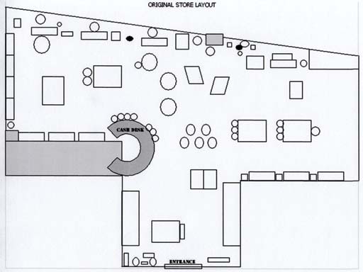
For one thing, having a bottleneck-shaped entrance makes this already high-traffic area even tighter. Even worse, placing the first mid-left unit up front causes unnecessary congestion. This is also a gamble to take—after all, if the products in this unit do not appeal to customers, they might figure it’s not worth the energy to maneuver around the tight space and check out the rest of the store. Those who do not find this first feature table appealing will simply leave without bothering to view other units.
 Take another look at the schematic—specifically at the cash wrap area. The tight grouping of fixtures here discourages exploration. When customers are forced to walk right up near the cash wrap to access other areas of the store, many will simply retreat. Psychologically, a cash wrap implies a state where the customer is ready to buy. Since the customer has barely seen all the store’s merchandise, she might not be ready to buy at this point or for more interaction with staff. This might explain the hasty retreat.
Further in, more fixtures grouped together create tight passageways or aisles. The minimum width of an aisle should be 3 feet. Anything less than this discourages customers from venturing into the area.
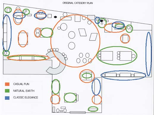
The second set of schematics shown above, indicates that the old store layout (above, left) also had different categories of products mixed in haphazardly around the store. Each colored balloon represents a certain kind of merchandise category. From a look at the schematic it is apparent that before the rearrangement, categories were scattered around without much thought.
Layout 101
There are three basic layout plans for most retailers. The first is a grid style commonly found in grocery stores and big box retailers. In this plan, products are easy to find as each aisle is marked with the specific product it houses. While this is a good functional plan, it may lack a bit of romance to the shopping experience.
The second type of common retail layout is the free-flow. This is usually found in smaller boutiques where the thrill of discovering new and exciting merchandise is found just around the next unit. Placement of fixtures may not have a set uniform pattern; however it makes sense with regards to adjacent merchandise categories and encourages multiple sales.
The third type of layout plan is called the racetrack. There is usually a set entry point and an exit, thereby encouraging customers to view as much merchandise as possible while going around the racetrack. Retailers usually mix up the racetrack with either the grid or free-flow styles.
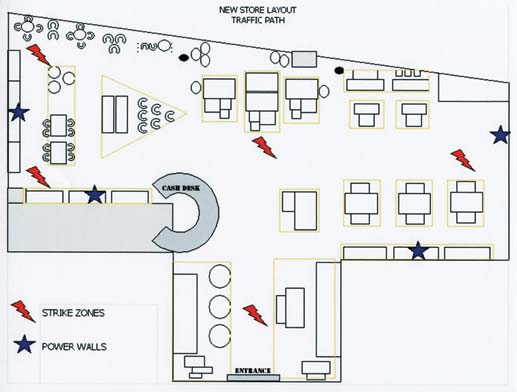
Before we return to the project, it would be helpful to revisit key terms in retail merchandising. A “power wall” showcases similar merchandise in an entire section. For example, an entire display of candles from a single company could form a power wall. By having a strong showing of a specific product line, customers’ attention is engaged not only due to the repetitive display of similar products but also because the store shows strength in a specific line of inventory.
A “strike zone” is a main intersection in the layout and signals the start of a new home for a merchandise category.
Implementation
For the store, the goal was to create a large racetrack with mini racetracks–essentially creating shops within shops. There are three distinctive product categories. The first includes natural earth-toned products ranging from handmade clay pots to soaps and candles. The second category is comprised of casual fun furniture and home accessories and the last category includes higher-end accessories.
These three categories—Casual Fun, Natural Earth and Classic Elegance—readily lend themselves to having a shop within a shop, their own mini vignettes. For the new layout, one category was chosen for each side and one for the middle.
The new layout outlines the proposed power walls and strike zones. Color O Living used strike zones to delineate not only the three main categories but also used these zones to further divide subcategories. For example, the right side of a strike zone may house kitchen accessories and the left may house a totally different subcategory such as stationery.
As can be seen in the schematic above right, the new arrangement sets up a defined traffic path, identified strike zones and four power walls. Each section of the store is now a designated home for a specific category.
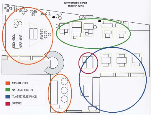
For example, the orange circles mark locations for Casual Fun products that range from kitchen accessories to stationery and furniture such as compact dining tables and chairs. The green area houses “Natural Earth” merchandise such as handmade clay pots and the blue section showcases the higher-priced mango wood products.
 There is a small section in the middle of the store, encircled in pink in the schematic. This section is called a “bridge” area and is used to spotlight one or two select products every week. The bridge features any product from any of the three categories. For example, mulberry papers from the Casual Fun category may be singled out as the featured product for the week.
When comparing the before and after of the new layout, it is apparent that well delineated categories and a clear traffic pattern emerge. When the transformation was completed, the sales for the succeeding months surpassed the store’s holiday sales. Unit sales per transaction went up 140% and overall sales increased 61%.
The bottom line take-home lesson is that having the best products in the world might not be enough if your customers can’t access them in a relaxed and easy fashion. Paying attention to your store’s layout—and even mixing things up occasionally—will be sure to have you reap rich dividends.
Editor’s Note: This store redesign was implemented by Natalie Tan from Retail Excellence Consulting. Tan is also the author of this article.